
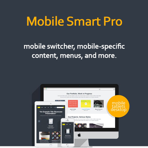
Mobile Smart Pro
$4.99 Free for Members
Mobile Smart Pro is a WordPress plugin that detects mobile devices and serves device-specific content to visitors. It also handles mobile theme switching and content visibility rules.
| Version | 1.4 |
|---|---|
| Last Updated | October 11, 2017 |
| Type | WordPress Plugin |
| License | GPL v2 or later |
| Live Demo | View demo → |
100% GPL · Original files · Unlimited sites
- Original, unmodified files — delivered exactly as distributed by the developer
- GPL licensed — use it on unlimited websites, personal or client
- Free updates — new versions appear here as soon as they are released
- Verified downloads — every file is integrity-checked (SHA-256) before release
Distributed under the GNU General Public License. Not affiliated with the original developer; official support, license keys and developer-hosted services (such as one-click updates) are available only from the developer.
Secure checkout with PayPal · GPL licensed · Instant download
Description
Mobile Smart Pro is a WordPress plugin built around detecting the device a visitor is using. Based on that detection, it can serve device-specific content and switch the theme shown to mobile visitors. It also provides rules for controlling content visibility and managing responsive behavior.
Key Features
- Mobile device detection – The plugin recognizes when a visitor is on a mobile device, which is the basis for everything else it does.
- Device-specific content – Visitors can be shown content tailored to the device they are browsing on rather than one version for everyone.
- Mobile theme switching – Mobile visitors can be given a different theme from the one desktop visitors see.
- Content visibility rules – You can set rules that decide which content is shown or hidden depending on the situation.
- Responsive behavior management – The plugin includes controls for how the site behaves responsively across devices.
Who Is It For
This plugin suits WordPress site owners and developers who want one site to behave differently for mobile and desktop visitors. It fits projects where switching themes or controlling which content mobile users see matters.